Why Your Website Is Your Best Salesperson
Your website works while you sleep. Five details that turn casual visitors into clients who trust you from the very first click.
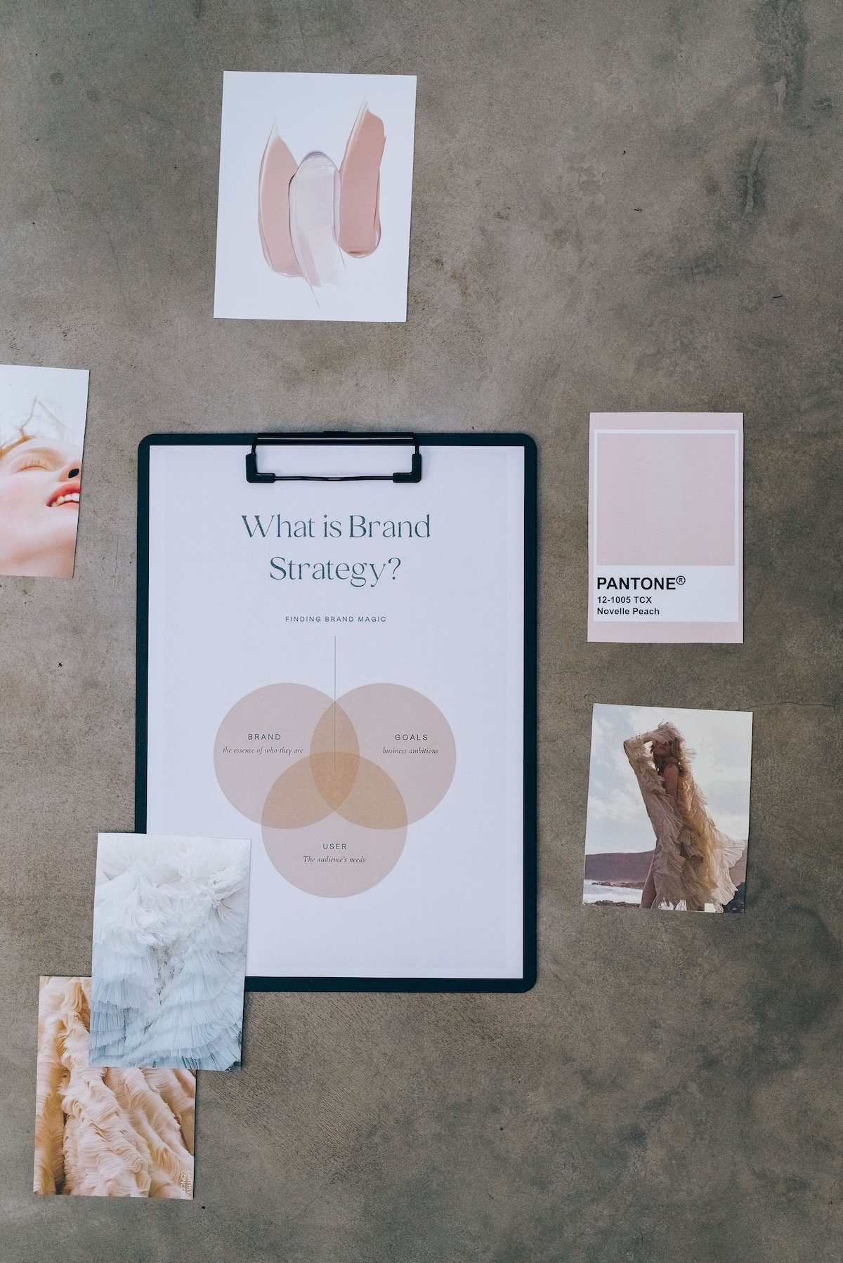
Colour is the fastest way a brand communicates, and the easiest to get wrong. Choosing a palette because it is fashionable this season almost guarantees that you will want to change it the next.
Before opening a colour picker, write down three words for how you want people to feel when they meet your brand: calm, energised, reassured, curious. Those words are the brief. Every colour you consider has to earn its place against them.
A palette is not about your favourite colour. It is about the colour your clients will come to associate with you.
Try the palette on a page of your website, a social post and something printed before committing. Check that text is easy to read and that the accent stands out. If it works in all three, you have a palette that will last.